
Color in UI design: rules for using hues
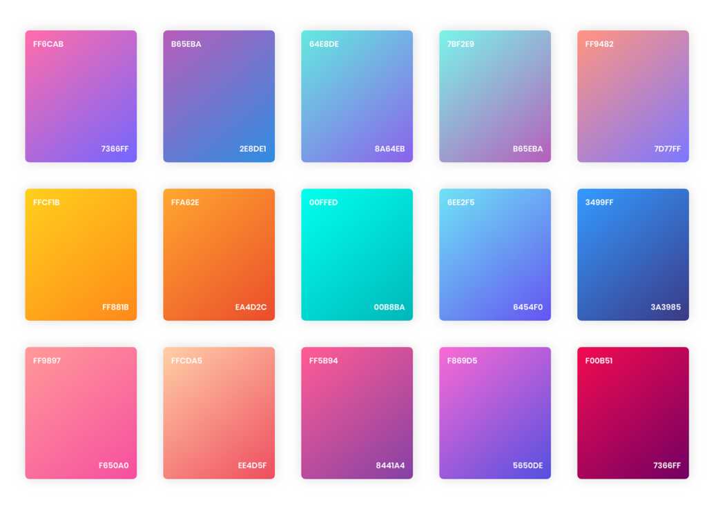
Color plays one of the key roles in UI design. It determines how the brand will be perceived, and what emotions it evokes in consumers. An important issue is the harmonious combination of different shades in the interface. And here works a simple but effective rule – 60:30:10, where each number corresponds to the proportion of the selected color. The main shade will be 60% – this is the base, and it should not cut the eye. In second place is the color, which will also be prominent in the design, but it should be half as much. A number of components will be colored in it. The share of 10% belongs to the contrasting shade, its purpose is to draw attention to certain areas. For example, this color can be used for the “Buy” button or another call to action. It is also suitable for decorating pop-ups and other points that need to be emphasized.
Some designers use the main color for the background, the second – for the design of banners, the name of the brand, and the title. 10% is reserved for buttons and creating accents on the site, such as highlighting certain lines. Following the 60:30:10 rule allows you to harmonize the color scheme in a mobile app or on a site. In this way, the design as a whole looks more thoughtful and attractive to visitors. This is extremely relevant today, as digital products are increasingly striving for minimalism and simplicity.
The contrasting color serves as a kind of assistant for the user. It highlights the most important things and concentrates attention on the moments that the brand considers important for itself and useful for the client.
It should not be forgotten that the use of color has a psychological meaning. Some colors are able to cause a burst of energy, while others, on the contrary, calm down, and moderate the enthusiasm. During the development of the ASOS website, the designers chose the design in black and white, which makes it look elegant. This method intensifies the perception of the products presented on the site, making them more stylish in the eyes of customers. At the same time, the “Add to cart” button is green, which creates an emphasis on the call to action.
Red traditionally means passion and activity. It can serve as an excellent contrast, but it is better not to make it the main one. Red too much can put pressure on the eyes, causing fatigue.
Blue is considered a calm color, it is associated with security. It is often used for the design of corporate sites, and resources with serious subjects.
Color in the UI design is very important, but it should emphasize the elements, and the structure, but does not play a major role in the design. Do not forget about the convenience and ergonomics of the product.